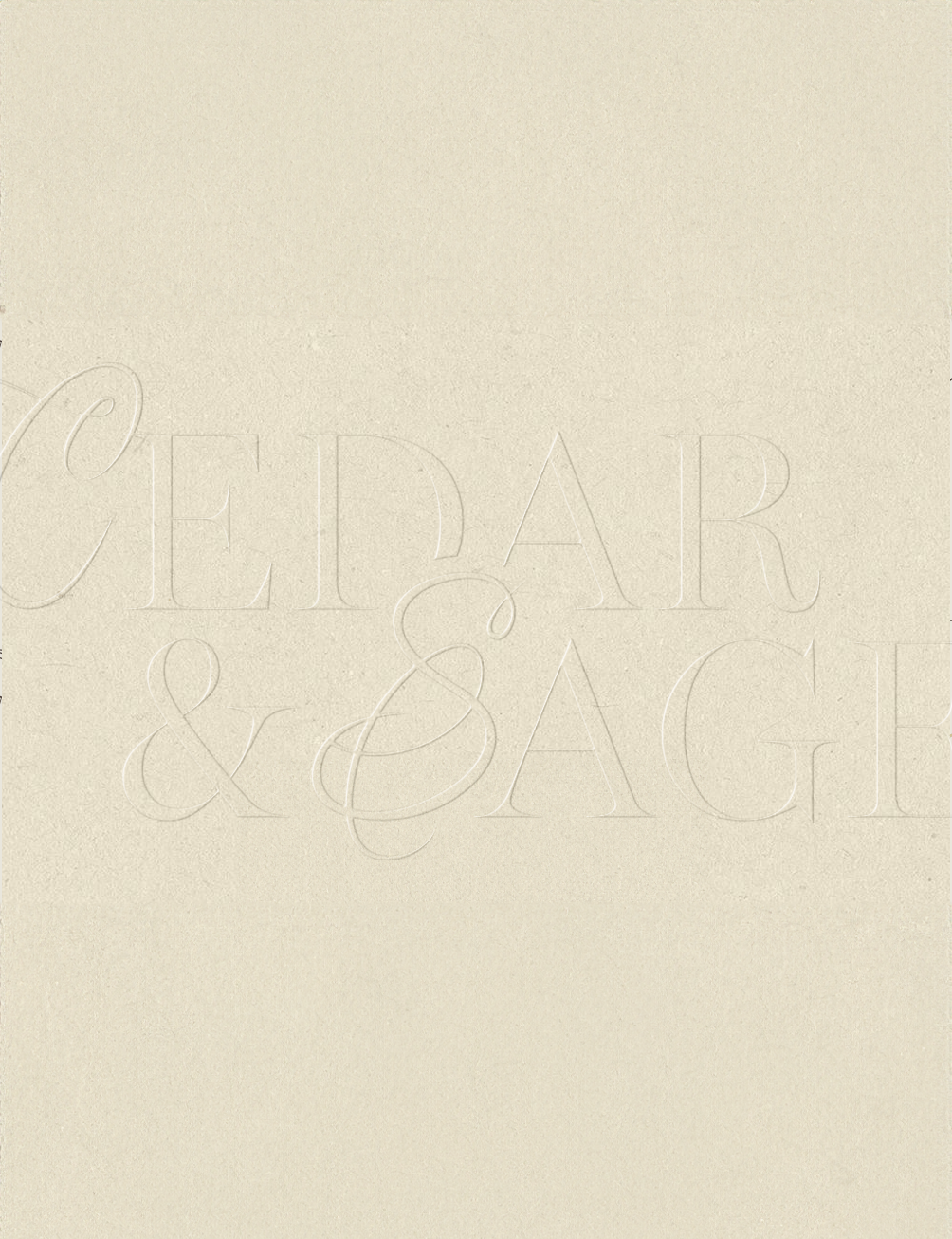
Cedar & Sage began as a small furniture studio with a deep appreciation for craftsmanship and organic materials. Their pieces were timeless and beautifully made, yet their visual identity didn’t fully convey the refined, warm atmosphere that defined their work.
-
We developed a brand direction that reflects the brand’s natural elegance and modern craftsmanship. By combining earthy tones, sophisticated serif typography, and subtle textural details, we created a visual world that feels grounded, luxurious, and inviting — much like their furniture.
-
The final identity captures the quiet confidence of Cedar & Sage. Their branding now feels cohesive across every touchpoint — from packaging to digital presence — helping them attract clients who value quality, authenticity, and timeless design.